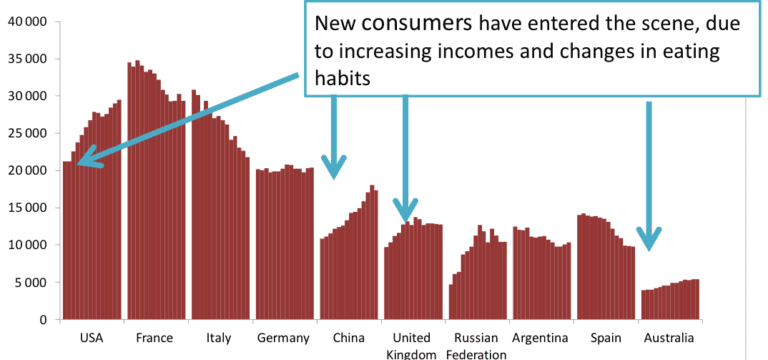
An infographic is circulating on social media that describes the state of the wine industry at a glance.
This is primarily a bar chart, and if you’re a wine producing country, you don’t want to be strapped for cash.
The infographic, originally published on Twitter by @WineStats and on various platforms subsequently, shows the top wine consumers by country between the years 2000 and 2013.*
It also shows increases and decreases within each country during this period.
This means that producers and their marketing teams may need to recalibrate in terms of geographically targeting the consumers they want to reach.
A key statistic, for example, is the country where wine consumption has increased the most.
Can you guess?
China.
The country with a sharp increase in consumption and higher volumes? UNITED STATES.
The country which is also increasing but erratically? The Russian Federation.
The country that remains generally stable? Germany.
The country with relatively low volumes but whose consumption is constantly increasing? Australia.
Countries whose consumption is falling suddenly? France and Italy.
The takeaways from the chart, and particularly from the broader report that is its source, provide plenty of food for thought.
This is because the goal of wine infographics, it seems to me, is a lot like the rind of a fruit.
At first glance you know what it is and what it tells you. (Banana. Apple. Mango.)
But it’s what’s beneath the first glance – the outer layer – that will support wineries and their business. (Potassium. Fiber. Vitamin C.)
Here are some other takeaways – under the infographic layer – from the report from the International Organization of Wine and Vine.
- Grapes are planted all over the world, but the The top five countries represent 50% of all wine real estate. Spain comes first, which is no surprise, followed by France and Italy. The fourth and fifth places – occupied respectively by China and Turkey – are remarkable, particularly China for its new plantations.
- AsiaVineyards represent 24% of the world’s total surface areacompared to 19.4% in 2000. The quantity of vineyards in China increased by 127% and that of India by 177%.
- The quantity of EuropeOn the other hand, the vineyard decreased from 62.4% to 55%. Both Italian and Spanish vineyards fell by 17% while those of France fell by 13%.
- About 39% of wine is consumed outside Europecompared to 31% in 2000.
- U.S. vineyard acreage increased slightlyfrom 12% to 14%.
- American wine – just like Austrian example that I recently described – decreased in volume but increased in value. Less wine is produced, but producers are paid better for it..
- Even as America’s domestic industry booms, it also overtook the UK as the world’s largest importer some wine.
- China produces 15% of the world’s grapes. Italy and the United States each produce 10% of the world’s grapes.
- A few 80% of the world’s wine is produced by just 10 countries.
- South Africa’s exports increased significantly in 2013when it took advantage of falling stocks in Europe due to a poor harvest in 2012.
- Global sparkling wine production has increased by 40% over the past ten years. Consumption of sparkling wine has also increased, by around 30%.
* The infographic was generated from a report entitled “State of the global situation of viniviticulture” produced last November by the intergovernmental association based in Paris. International Organization of Vine and Wine, or OIV,
Find Cathy Huyghe online at cathyhuyghe.comand on Facebook, TwitterAnd Instagram.


